• Shop
    • Like Water
    • STEM Series
    • Delay No More
    • For Dogs
    • Masks
  • About
  • Finds
    • People
    • Places
    • Things
  • Blog
FINA
  • Shop
    • Like Water
    • STEM Series
    • Delay No More
    • For Dogs
    • Masks
  • About
  • Finds
    • People
    • Places
    • Things
  • Blog

Touched by G.O.D.

The interior of one of the six G.O.D. stores located in Hong Kong. This particular location is by the expat neighborhood: Lan Kwai Fong (2019).

The interior of one of the six G.O.D. stores located in Hong Kong. This particular location is by the expat neighborhood: Lan Kwai Fong (2019).

The Chinese character, Róng (融), which translates as “to blend” or “to merge” in English, is a great character to describe Chinglish. It began as a joke, a mistake — Cantonese speakers in Hong Kong would try to describe something in English but would end up finishing their thoughts in Cantonese. But Chinglish is actually much more than just a joke or a mistake, its been deeply rooted in Hong Kong culture. The definition of Chinglish is in the name itself, it’s the blending of both the Chinese and English language. Due to the British colonization of Hong Kong, people grew up speaking Cantonese at home and educated in English at school. Not only was this linguistic duality happening in their education, it was happening in their everyday lives: the disc-jockey on the radio would switch between Chinese songs and English songs and they would even celebrate both the Western and Chinese holidays. Chinglish is more than just a language, it’s a lifestyle (Tam, p. 270, 2000). And the creators of the Hong Kong brand, Goods Of Desire, know of that all too well. 

Douglas Young and co-founder, Benjamin Lau cleverly used the Chinglish language to conceive the brand name of their fashion and lifestyle company. The abbreviation of the brand is called: G.O.D. and, according to Young, he never intended for the brand to be pronounced as “God.” In an interview from the South China Morning Post — now the oldest English language newspaper in Hong Kong (Wong;p.13;2002)  — Young initially conceived of the brand name in Cantonese. The acronym came about when Young came up with the Cantonese name: Jyu Hou Di (住好啲) — it directly translates as “To Live Better.” But the phonetics in its Cantonese name sounded similar to the English letters: G, O, and D and that is how the brand developed its English name.

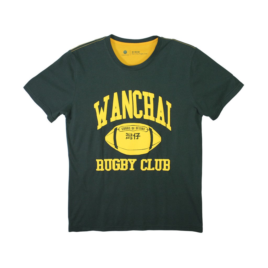
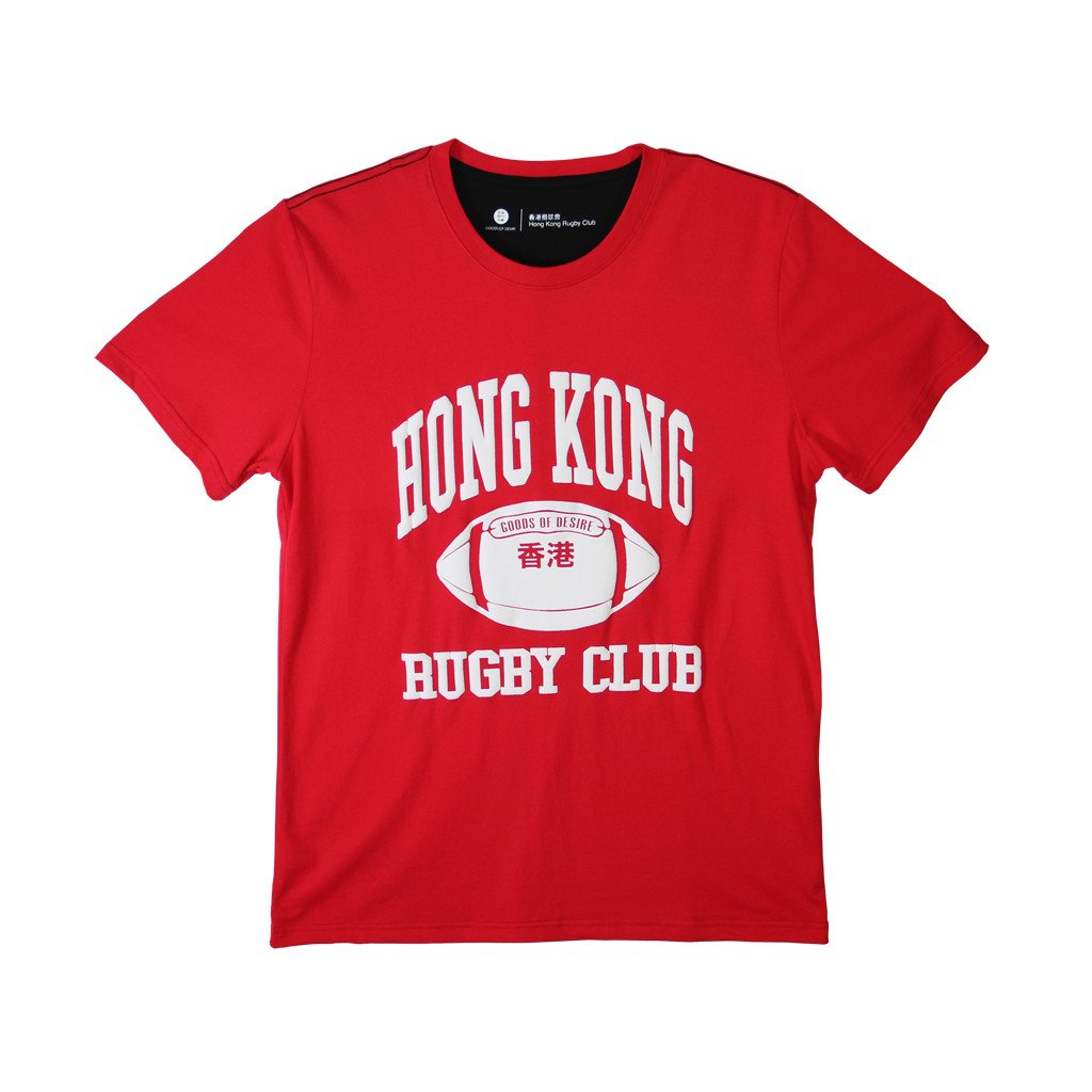
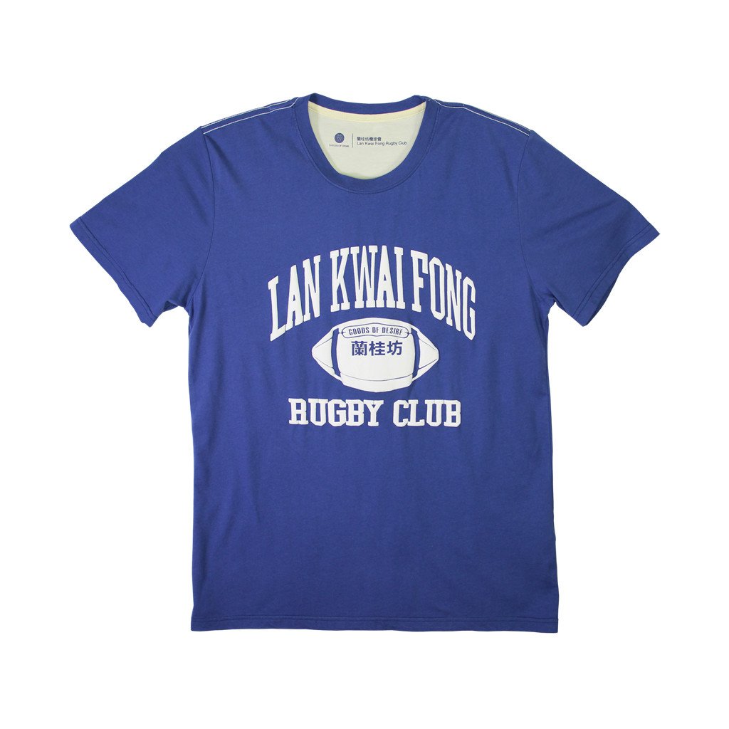
In addition to drawing inspiration from their beloved city and its culture, they also showcase pride as “Hong Kongers”.  Goods Of Desire, or G.O.D., has a line of T-shirts that quite literally exemplify Chinglish. Though their English counterpart of the Cantonese word does not actually translate to an English meaning, their intention is to be humorous — particularly to native Hong Kongers. Their other t-shirt’s mimic the jersey style which has been made popular by many western brand’s like Abercrombie & Fitch. But the original intent of the jersey was to showcase pride or team spirit for their respected athletic team. As for G.O.D.’s line of jersey-inspired t-shirts, they’re designed to represent pride for Hong Kong, its people, and its culture.

Please click through to view their selection of t-shirts:

Wanchai_1024x1024.jpg
Hong_Kong_1024x1024.jpg
LKF_2f9fb0d5-0ebe-4f46-9ee7-84192f46d1af_1024x1024.jpg
delaynomoretshirt_1024x1024.jpg

Citations:

Wong, Wendy Suiyi; Hong Kong Comics: A History of Manhua; Princeton Architectural Press, 2002. pg. 13

Tam, Vivienne; China Chic: A Visual Memoir of Chinese Style and Culture/Vivienne Tam; HarperCollins Publishers Inc., 2000. pg. 270

Zhang, Jing. “Douglas Young of Hong Kong lifestyle store G.O.D. on the places that inspired his designs” South China Morning Post, 7:15PM October 1, 2017.

tags: G.O.D., Hong Kong, Chinese, Design
categories: Asia, Fashion, Design, Places
Sunday 08.25.19
Posted by Lawrence Wong
 

Future's Past meets Future's Present — Guangzhou, China

View of Zaha Hadid’s Opera House (on the left) and its backdrop from the 3rd floor of the Guangzhou Library in Zhujiang New Town — a newly developed area in Guangzhou, China.

View of Zaha Hadid’s Opera House (on the left) and its backdrop from the 3rd floor of the Guangzhou Library in Zhujiang New Town — a newly developed area in Guangzhou, China.

Guangzhou is the capital of Guangdong, a province located in the southern region of China. This metropolitan city neighbors Shenzhen, a once rural area inhabited by peasants and farming villages turned largest tech hub in China (if not the world). This is a prime example of what is happening in many other major city’s around the world — the impact of the future’s desire for change. The future isn’t always fair but it is unbiased — natural forces like gentrification and globalization are bestowed upon us so that we are well-prepared for its arrival. While the transition may be rough and unexpected, some cities like Guangzhou may have already provided themselves with a blueprint. I was lucky enough to have explored this city during this shift. And amongst of all the emerging new, I discovered a side of the city that not only showcased what the future had in store; but where the future had been hiding all along.

I stayed at the South & North International Apartment located near Beijing Road, a major shopping destination for locals and tourists alike. The International Apartment is a high-rise multi-use building with a restaurant on the 8th floor, a food court on the 7th and a department store throughout the remaining 5 floors. The hotel only had three active elevators and they not only serviced the hotel guests, but the diners and shoppers as well. Waiting for the elevator to arrive was like a game of patience. It’s almost impossible not to play because the rooms for the hotel began on the 9th floor — my room was on the 15th. You could try and take the stairs but alas, the weather and the mountainous stairwell would eventually catch up to you. Once when the elevator arrived, the patience game eroded and it quickly turned into a game of survival. By this time, more people have shown up and we, passively yet aggressively, are trying to grab a spot in the elevator.

After settling in to the room, I took a risk and went back down to the lobby to have a jaunt around the block. The hotel was located in the Arts district where I noticed the streets lined with store fronts filled with oil and acrylic paintings (ranging from knife palette abstract’s to still life). The lighting from each and every stall made the paintings all the more enticing. There were even stacks of paintings pouring out on to the sidewalk, one by one, laying against one another, were copies of Yue Minjun’s infamous smile and portraits of Mao Zedong. Along side the stalls of forged art were stalls that sold various brushes, stamps, inks, and paper — tools primarily used for Chinese calligraphy or calligraphy-based art; other stalls sold materials for framing (or wall mounting) and they can even customize any type of frame imaginable. I was beginning to see the Arts District as a district that manufactured works of art.

The next day, I ventured to another district. And much like the Arts district, the streets were filled with stalls. This time, the stalls were selling random goods like pencil’s and pen’s, shopping bags, and envelopes, and bubble wrap. It wasn’t noticeable at first but there was something peculiar with the way these stalls appeared — they all looked identical. And that’s exactly where the peculiarity lied, every stall looked identical because none of them differentiated themselves whatsoever. Even the products they carried were identical: envelopes in various styles and in every size, simple shopping bags made of plastic or polypropylene fabric, and different weights of bubble wrap. Eventually, I realized that the small shops and stalls, no matter which district, were actually showrooms that displayed what their factory can produce — whether you can simply purchase a single envelope hasn’t been determined. Why were they all identical? They may seemingly be as such, but I later discovered that this was pure strategy. Each district was organized in accordance to the types of products the stalls would carry, this essentially made it “easier” for prospective customers to find what it is they are looking for. But this also made it very difficult to make a decision. And I can firmly attest to that after my visit to the Zhongda Fabric Market in the Haizhu district.

That same day, I took the subway to the Sun Yat-sen University Metro Station — where the fabric market is located. Without any prior knowledge of the area, I have concluded that the phrase ‘fabric market’ was a bit of an understatement. The area spanned over 1,000,000 square meters and it was comprised of nearly 30 different fabric and accessories business centers that housed hundreds, even thousands of fabric merchants and wholesalers.

According to the website of the same name, the Zhongda Fabric Market began in 1987 when a group of people decided to move into an abandoned area close to Zhong San University so they can (continue to) sell their fabrics illegally. The market developed slowly but it was still all too disordered. In 1996, The Guangzhou Municipal Government started a standardized management and reformation plan where they built some simple temporary sites for the vendors to move inside. Meanwhile, another market in a nearby province gained much more traction, leaving the Zhongda Fabric Market to weaken. But in 2001, the Guangzhou government placed this area under a municipal development program, rapidly expanding the market and turning it into what it currently is today — the self-proclaimed “World Trade Fabric Center.”

One of the many buildings that occupied this area is the Guangzhou International Textile City. This 7-story building took up 310,000 square meters and it was occupied by 4000 shops that sold every type of fabric imaginable. I was immediately overwhelmed by the enormity of the space — the building was so big that the roads continued into the building, this enabled automobiles to drive in to the building and share the space with fabric shoppers. As you take an escalator up to the first floor, the intimacy of actually being in a confined space (somehow) takes over. But if you look down from the escalator, the bustling traffic of cars and people are right under your feet. Once when I noticed the juxtaposition, every sci-fi movie with scene’s of a futuristic dystopia suddenly rushed into my brain. The Japanese cult-classic Akira, for example, even the beginning scene’s from The Fifth Element.

Luc Besson wasn’t too far off from reality — in fact, I was looking right at it.

C6BDF672-FCB5-4A03-B986-7A071D2CD1AB.JPG
View from the main floor of the Zhonda Fabric Market

View from the main floor of the Zhonda Fabric Market

Top floor view of the Zhongda Fabric Market

Top floor view of the Zhongda Fabric Market

IMG_2902.jpg

I headed for the top floor which was the ‘food court’. When I arrived, I immediately noticed the Super Graphics — which acted as the way finding — that encompassed the walls. And considering how bare and empty this floor was, the graphics really stood out in comparison to the floors underneath. On either side of the floor lied huge decals with simple icons for the bathroom and elevator, they hovered over the windows which naturally brightened them up. The huge wall painted in orange with a letter “D” in a modern san-serif typeface lied over the entire wall. I believe the “D” stood for “Down” because the elevator icon was right behind it. Simple graphics with a very simple function.

Top Floor Graphics and Way Finding

Top Floor Graphics and Way Finding

Graphics.png

After a brief excursion around the top floor, I popped in to one of the restaurants and had lunch. It was a Chinese restaurant serving Northern style Chinese fair. To the left of the entrance lied a meticulously clean and organized kitchen. Like Le Corbusier’s philosophy on the home — the kitchen was simple and had no frills, they just had the necessities — it was prepared to function. The carry-out bags with their restaurant name in a simple ‘san-serif’, bold typeface were hanging against the counter. The color of signage for the ingredients facing the customer matched the color of the bags. Even the simple stapler, jet black, stood out against the red and beige countertop. The plastic containers were all aligned and color coordinated — it would be blasphemous if they were not aligned to their color-way. The metal ladles were also facing the same direction. And all of this was in the forefront of a simple white tile backdrop with streaks of black placed evenly in a diagonal pattern. This was the epitome of beauty and aesthetics.

Restaurant on the Top Floor, the prominent use of the colors: Red, Black, and Green stand out amongst the minimalist yet functional setting. The Restaurant may be called “98 Cents” as written on the carry-out bags.

Restaurant on the Top Floor, the prominent use of the colors: Red, Black, and Green stand out amongst the minimalist yet functional setting. The Restaurant may be called “98 Cents” as written on the carry-out bags.

Whoever is the architect for this amazing structure has yet to be found. From my research and interviews, nobody can tell me who the Guangzhou Government hired to conceive of such a structure. And never in my wildest dreams would I have thought that the actual market itself would further solidify my appreciation for beauty and aesthetics, particularly in the (seemingly) chaotic of spaces.

 
People
Things
tags: Guangzhou, China, Architecture, Speculative Futures
categories: Design, Fashion, Futures, Asia
Thursday 07.11.19
Posted by Lawrence Wong
 
View fullsize Learn more about our Creative Director, Lawrence Wong. The designer behind the FINA brand.

#newlook #techbags #handmade #presale 
#fina
View fullsize
View fullsize
View fullsize
View fullsize
View fullsize Prototyping, keep on keeping on. #fashion #bags #cottoncanvas #asianmade #apparelconstruction #prototype